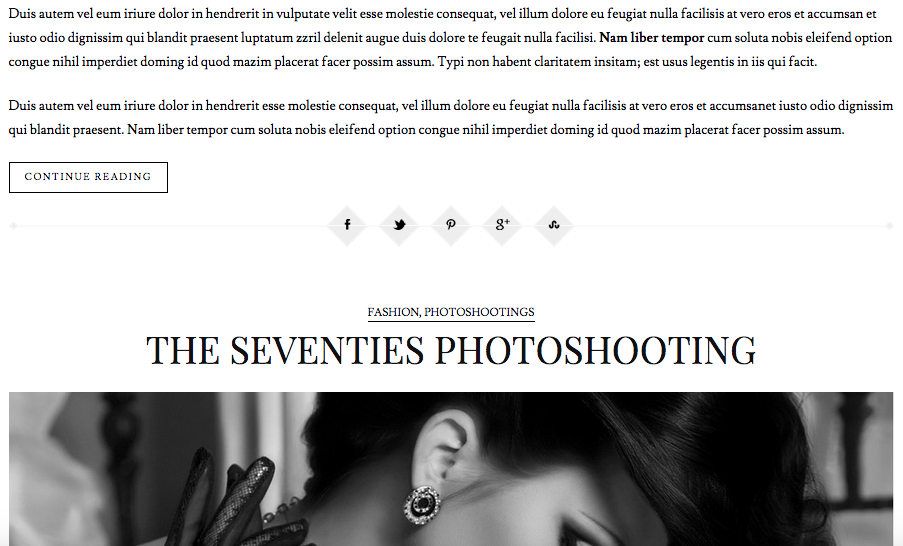
Scribdo is a “minimal fashion blog for creatives” with a classic, yet modern design. It has a simple, minimal layout and typography, and a black and white color scheme. It has a professional, visually pleasing design that incorporates several CSS elements and techniques that can be applied to the site I am designing for the Missourian’s “Columbia, Missouri: Scenes from Then and Now” series–a story I am telling in chapters, much like a storybook of the university and town.
The first element that drew me to Scribdo was its typography, most of which uses the font family Lusitana, Helvetica Neue, Arial, Helvetica, Verdana, sans-serif. Titles are aligned to the center with an uppercase text transformation, and paragraphs are aligned to the left. The difference in size between the paragraph copy and headings, 18px to 36px, creates contrast and visual interest.
Another successful Scribdo technique is the image sizing that spans 94% of the page, with 3% padding to the left and right. This technique can be applied to the visual storytelling I am attempting to do with the Missourian photo series. The bottom navigation is another element that can be applied to the site I am designing. It uses a 1px border, a 10px padding and margin, and a a text size of 13px.
Scribdo is a great source for inspiration as I begin to write CSS for the Missourian’s “Columbia, Missouri: Scenes from Then and Now” series. Its minimal, classic, modern design is a way to showcase photography and to tell a visual story that is historic yet familiar to Columbians and Tigers.

I agree with you about the typography, and I think the designers did strong work for the typography of the site. The text threw me off for a little while though, since I wasn’t expecting the non-English script toward the middle of the page.
The typography is modern, and it gives the website a serious and professional tone. The focus of the website is the photography and fashion of the website, and the typography allows for this sense of the website to develop. I think the website could add more photographs, and this would help the website add more content and focus.
The positioning of the images is an interesting feature of the site. The images are large and prominent, and I liked the fact that they spanned across the entire page. The uppercase text in the headline of the website gives the website a classic look, and the text and positioning is very professional.
The black and white theme of the website also makes the content striking and unique. I think this was a strong color choice by the designers of the site, and it gives the site a more creative look.
-Natasha Brewer
LikeLike