Media Storm does a lot of really visually gorgeous journalism. They focus heavily on video and interactivity. My first impression of going to their home page was that the aesthetic wasn’t nearly as beautiful as the projects they put out. I’m not a huge fan of the typography or their logo. That being said, the usability of the site is quite good.
Navigation is intuitive. Along the top bar they have an “about” tab that is one of the first things a new user would see and could explore if they were confused about just what Media Storm is and does. Also along the top is a search bar. This is an important feature for a site that covers such a wide variety of stories. If the viewer is only interested in a particular subject or story this allows easy navigation.
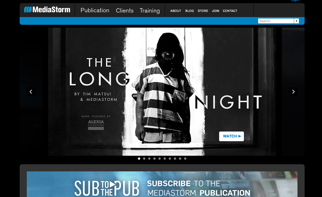
Media Storm adheres to rules of visual hierarchy. Each page has a tab for navigation along the top with a large video player beneath it and the viewer must scroll to see more content like suggested videos and credits for the project.
The videos are displayed in two ways:
- In a slideshow that the viewer can click through at the top
- As individual thumbnails below
The thumbnails are organized into categories, which further organizes the information. In order to play any of the projects the viewer just clicks on them, it’s intuitive.
In general, the layout of the website is pretty conventional and in this case predictability is a good thing. If a viewer wants to look at specific content they can easily search it or check categories for what they are looking for. If they want to see how much it costs to subscribe the “join” button is at the very top of the page. The Media Storm logo is clickable to direct the viewer back to the homepage. The search bar is located in the top right corner. These are all features that internet users are accustomed to seeing and using. The adherence to the status quo on these simple elements of the website keeps viewers from thinking about the site itself and allows them to focus on the actual content.
One thing I find less than great about their system is that the paywall they use is not transparent. A viewer can watch certain things for free and without any indication that there is a paywall at all, but certain things can’t be watched unless you are a paid subscriber to Media Storm. This affects usability because if a viewer is unsure of what content they can and can’t access they may become frustrated and leave the site altogether. The New York Times model is one solution to that problem. Their website shows a pop up notification explaining their paywall policy when a non-subscriber reads their online content. Obviously Media Storm’s paywall policy is different so instead of telling the viewer how many free articles they have left this month the notification would have to say something like “This content is available for free until _____. To see older content subscribe here.” Paywalls are always a possible deterrent to viewers so carefully and transparently designing one is vital.
-Danielle Dieterich

I agree with your comment about the typography and the logo: they aren’t very attractive. I first thought the website was a hate site with a similar name; it wasn’t until I scrolled down that I realized it was different. They could stand to make their logo a more unique for this reason alone.
I’m not a fan of the black background; it’s very dark and heavy to me, and it gives the content a very serious, almost sinister feel. I’m not very familiar with MediaStorm, but I assume the effect they’re going for is either very serious journalism, or very artistic journalism. I agree that the interface is very intuitive, but it’s not fun to use. I don’t like scrolling down a long, dark page to view thumbnails that aren’t even paired up evenly. One thing that wasn’t intuitive was the menu button; it appears as you mouse over the main image and appears to lead to something more pleasing, but there’s nothing I’d want to click on. The About section when you scroll down on a story’s page looks cluttered and unattractive. Though their journalism might be intriguing, their site isn’t.
LikeLike
I share the same feeling with you regarding the overall impression of MediaStorm’s work–“visually gorgeous.” In addition, the site is so well-designed that you can summarize most of the Krug’s five guidelines simply by analyzing the website. However, it’s not very clear which parts of the website are clickable (even though most of the areas contains a hyperlink to somewhere). But I do think they did this for a reason: to reduce the intrusiveness of highlights, underlines, etc.
I agree with you on the “invisible paywall,” but it shouldn’t be to blame so much, since, after all, MediaStorm is a for-profit enterprise. As long as the navigation and control of users can be justified and appear in an non-hurtful way, we should consider it a very business-minded but clever design.
LikeLike