Newsy is one of my favorite news aggregates and start-ups which happens to have been founded locally in Columbia, Missouri. I’ve usually interacted with Newsy on their iPhone App, so it was a new experience to navigate the news stories via their homepage from a laptop browser.
Viewing their website for the first time, my first impression is that it’s clean and simple. The black background gives it a modern and technological vibe. The color pallet is limited and not overwhelming, with mostly neutrals and accents of their signature logo blue. From the beginning it’s easy to navigate. It’s also clear from the first impressions that this home page isn’t the choice interaction that they would like to have with you — they want you to use their variety of apps. There is an Apps header at the top of the page that is dominant.

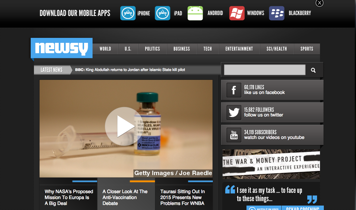
The largest visual is the scrolling video player of the various headline news from the day. This video player isn’t auto-play which is appreciated from a viewer perspective. It acts as a courtesy to not overwhelm the viewer with the auto-play, but rather gives choice and power to choose their viewing experience.
According to Krug’s guidelines, Newsy follows the first guideline of having a clear visual hierarchy very well. At the top of the page you’re offered the newest and most relevant information first. Then as you scroll down the page you’re given more secondary and specific news viewing options.
The Newsy website is very clear showing what is a link. The video player shows a play icon. When you hover over a headline, it changes from white to blue also showing that it is clickable. I never wondered if something was clickable and a majority of the elements on the page are interactive and clickable. This website also uses and intuitive vertical scroll, taking advantage of another one of Krug’s principles; Take Advantage of conventions.
This website is clean and uncluttered with a limited amount of noise. The layout is understandable and intuitive. It is clear that different parts of the website are in different areas of the website. There is the App header, the social media interaction sidebar, the prominent headlines of the day and then the smaller video player of secondary news clips. With an organization that is focused on video clips, it could easily become cluttered and overwhelming interface, however, Newsy did a great job balancing the dominating nature of video news with an easy, digestible layout. However, overall, it feels very much like Newsy ‘played it safe’ with the layout of the website. I would love to see more experimentation and creativity with engagement on the sit. This emphasis of creativity would add memorability to the Newsy brand experience and ultimately make the webpage even more engaging.

I agree with your assessment. Everything’s clean and well-organized, but they really did “play it safe” with this design. It feels very canned, sort of like something that might be available as a pre-made theme on Tumblr or WordPress. But the interface is easy and the site navigable, which is all they need at their core. Newsy’s successful, but they’re also relatively new, so maybe those “risky” changes will come with time.
LikeLike
I like Newsy for it’s clean look as well. It’s organized in a way that is user-friendly for all skill/experience levels. The simplicity of the color scheme definitely gives off a modern-vibe and makes it easy for users to navigate to what they want.
LikeLike
I agree that Newsy does a great job of following Krug’s five criteria. It’s simple, it’s not fancy, but that contributes to a clean, concise, and comprehendible user experience. It’s design serves Newsy’s purpose well.
LikeLike